
For a logo to reproduce in various formats it is generally a good idea to have a very high resolution picture file (ie rasta file - with pixels) oooorrrrrr even better, have your logo in a vector format (in lines and shapes). It will save your logo becoming soft and/or blurred.
Black is OK ... but ... it can be a pretty restrictive colour - a sweeping statement - however research shows that humans like, and are attracted to, colour and a coloured logo will generally be more eye catching.
When thinking about colour make sure your feature colour has multi use and multi design capabilities – ie when the logo is reproduced on a white background there generally lots of choice, however often logos will be used on coloured, dark or black background. The logo needs to be able to handle all background colours and colourways. Added to which there are occasions that the logo will be produced in black and white only. The logo design needs to be able to handle those occasions too.
A strong logo icon and robust logo type is important for reproduction – anything too fine or too light will be wishy washy and fade away to the human eye. – there is only a nano second to make that logo brand impact, if it is not strong and visible the opportunity will be lost.
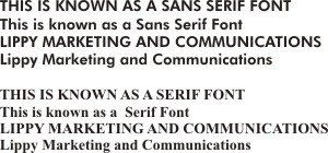
Generally speaking where there is a lot of text or a range of capital letters, fonts with Sans Serif become blocky to the human eye. In other words the eye tries looks at each individual letter rather than reading a series of them together. If the same text uses a Serif font then the eye has much less to struggle with. Equally using upper and lower case can assist the eye further in capturing a statement or a range of text
Finally a good logo will generally have two basic design elements to its design. There will be an icon that can be used along with the logo type or indeed as a standalone icon or avatar. Equally the logo type (ie the words) should be able to be used as a standalone aspect of the company brand.
Using the above as guidance will help you create a strong logo - and if you have any questions contact me at
No comments:
Post a Comment