Thursday, 11 August 2011

Brand Yourself. Sell Yourself.

Sometimes, just sometimes, people look at me as if I am a total wally... Ok they look at me like that a lot – but concentrating on branding for a moment – there are three main reasons:


1. When I talk about branding, impact and personal branding.
When people are asked about branding, most think - company logos, names and tag lines (eg. Just do it. Nike) and maybe even uniforms; but there's a lot more to branding than just colours, logos and names – and it is exactly the same for individuals.

It drives me slightly over the edge when I hear people talking about personal branding and in the same breath list off typical corporate clothes - ie cream suits or red ties as the answer to everything.
That’s just not it!... We already know that most of us get in a flap about what we should wear to an interview, a first date or a big event ... but what about the rest?

So if personal branding isn’t just about the clothes or shoes or matching bicycle clips - what is personal branding about?
It's about conveying who you are and the value you bring. It’s about communication. Not just the words you use - It's how you use words. It's how you interact and react. It’s your body language. It's the entire presentation of yourself.

2. When I say people need to 'sell' themselves.
We all have to sell ourselves at some point. And like most people you probably don't want to seem hugely conceited  or self-serving, however there is a balance and you need to present yourself, your product or service in the best way possible that also allows you to maintain your dignity and self-respect.

Properly promoting yourself and using your brand to help can open doors, but at the same time shameless, loud self-promotion can damage your public image.
Personal branding is not hard – I do it, so it must be relatively easy, but it doesn’t happen over-night and it takes a bit of time - but it really isn’t rocket science.

Main Personal Branding Aims
  • Define yourself. If you are clear about yourself, then people will find it easier to understand and ‘get’ you.
  • Identify your value(s). Clearly identifying what you offer and what you do – your core products/services. 
  • Define your over-riding message(s). Every public touchpoint – ie website, social media account, business cards etc need to relate the same clear message(s)
  • Create your public image. With the Internet so much is possible – I would suggest you need professional photos, business cards, readymade materials that can be tailored for when people want more information, a website and/or a blog, consistent social network presence – that doesn’t mix your social, family side with your professional, business side.
  • Ensure consistent brand delivery. Once you have things is place you need to maintain a consistent brand – anything else will undo your personal work, confuse and dilute.
3. Imagine that you’re not you.

Of course what I mean is – imagine you are your target audience, your customer of choice.

The fact that you have been an international trifle decorator for the past twenty five years might be of huge importance to you but from a client or potential customer’s point of view, first and foremost they generally want to know that you can provide a perfect solution to their requirement.

Cos let’s face it ... no one actually want to spend any money with you....

What they really want is the solution - and by that I mean what they perceive you can help them achieve, or how you can make them feel.

So in pretty much any situation where you are looking to promote yourself or your services or your company, the best place to start is by figuring out what your audience or potential audience wants.

Once you understand your audiences' needs you can tailor yourself and your wares to their requirements. Leading with their priorities, rather than your own.

For further information, help with branding or personal branding or if you want to argue a point email thirza@lippymarketing.co.uk

Wednesday, 22 June 2011

Branding is not an 'off the shelf' purchase

OOooh ... doesn't it make you - er - smile!


I have the opportunity to work with some lovely business people. Business people who really seem to understand the value of looking professional and building a consistent business brand - yet recently, I have come across some clients who have adopted 'off the shelf' logos or stock design business cards.


Great Ideas - right?!!?


Let me put it this way - I have a lovely client that I would class as a friend. When I met her she very excitedly showed me her new business cards. Bought online (nothing wrong with that). Contact details all her own (excellent). Colours and layout as 'suggested' by the printing company from their stock designs (arghh!).


So why did I cringe so violently?


In her business, her clients and her target markets are high-end corporate clients, national organisations and global institutions. The business cards design she had chosen, although good colours and a simple layout, were not her own. She used a stock design from an online printing company ... which of course means that any other business could use that design - window cleaner, child minder, mobile nail extension technician.... car valeting, taxi services, piano teacher ....


Now I'm not saying this client is any better or worse than small businesses - what I am saying is there is a time and occassion for business resources to be used - and when you run, even the slightest risk, of one day a client or potential customer saying - 'Oh my dog walker has a business card like yours and you want to charge me £1,600 a day for your services' - it affects your brand.


Logo Libraries - The same should be said for those occassions that business people might use online logo making software and services for their business.


This service is also great and OK for some - but when you are dealing with bigger businesses and corporates; and/or you intend selling your business for the odd million or two; having an identical logo that, firstly others might have and secondly cannot sensibly be regarded as your business's unique and valued corporate brand, then you have to think - it may affect your brand.


I'm not about sour grapes - I think both services are excellent - however, keep your eyes wide open and your brain in gear.


If either of the above will affect your business brand in the slightest negative or hesitant way - don't do it. It is so much more expensive to restart than get experienced branding help from the get go.

Tuesday, 31 May 2011

How to Design a Strong Logo

Recently I have had conversations with a few people regarding logos and branding for businesses... now I am all for innovative thinking and new ideas, however there are a few human things that you should be aware of if you are thinking about designing your own logo...


For a logo to reproduce in various formats it is generally a good idea to have a very high resolution picture file (ie rasta file - with pixels) oooorrrrrr even better, have your logo in a vector format (in lines and shapes). It will save your logo becoming soft and/or blurred.


Black is OK ... but ... it can be a pretty restrictive colour - a sweeping statement - however research shows that humans like, and are attracted to, colour and a coloured logo will generally be more eye catching.


When thinking about colour make sure your feature colour has multi use and multi design capabilities – ie when the logo is reproduced on a white background there generally lots of choice, however often logos will be used on coloured, dark or black background. The logo needs to be able to handle all background colours and colourways. Added to which there are occasions that the logo will be produced in black and white only. The logo design needs to be able to handle those occasions too.


A strong logo icon and robust logo type is important for reproduction – anything too fine or too light will be wishy washy and fade away to the human eye. – there is only a nano second to make that logo brand impact, if it is not strong and visible the opportunity will be lost.


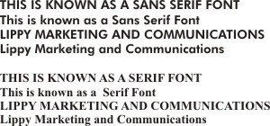
Generally speaking where there is a lot of text or a range of capital letters, fonts with Sans Serif become blocky to the human eye. In other words the eye tries looks at each individual letter rather than reading a series of them together. If the same text uses a Serif font then the eye has much less to struggle with.  Equally using upper and lower case can assist the eye further in capturing a statement or a range of text


Finally a good logo will generally have two basic design elements to its design. There will be an icon that can be used along with the logo type or indeed as a standalone icon or avatar. Equally the logo type (ie the words) should be able to be used as a standalone aspect of the company brand.


Using the above as guidance will help you create a strong logo - and if you have any questions contact me at